Depicting complex data visually is an essential aspect of any business, organization, or academic study. This skill enables the simplification of vast amounts of data, making it more understandable and easier to absorb. A common method used for this purpose is a column chart, a simple yet powerful tool designed to represent data. Keep reading to plunge into the captivating world of column charts and how they could be your helpful allies in data presentation.
Table of Contents
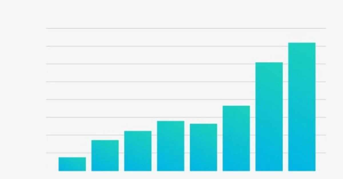
The Essence of a Column Chart
Whether through school assignments, business meetings, or even unveiling governmental budgets, column charts are everywhere. A column chart is a type of graph that uses vertical bars to represent data. Its primary function is to show comparisons among different categories, magnifying differences and revealing noteworthy trends.
Each bar in the chart represents a group defined by a categorical variable. The height of the bar corresponds to the value of the group, clearly indicating the size difference among groups. Column charts are particularly effective in displaying nominal data or ordinal data, where the order of categories is essential.
The potency of column charts becomes apparent when one understands the principle that human beings are primarily visual creatures. Our brains process visual information considerably quicker than text. It is, therefore, no surprise that a neatly organized chart might replace pages of data in a report, saving precious time and energy for the reader.
Applications of Column Charts
In today’s data-centric world, the land of column charts is truly vast and rich. These charts have found their way into every possible segment, making big data visual and digestible. For instance, business leaders commonly use them to analyze sales figures, profits, or other performance indicators. They can also detect seasonal fluctuations and long-term trends, helping decision-makers craft business strategies.
In academia, column charts are indispensable for students and researchers alike. The comparison of different groups and categories in a scientific study, the analysis of patterns in social science research, or tracking environmental changes over time— column charts are at the heart of it all. With these charts, complex and voluminous data become accessible and comprehensible.
Beyond businesses and academics, column charts also play a crucial role in informing public policy. Governments use them to present budgets, population statistics, or health data to stakeholders, media, and citizens. These charts act as an interface between complex governmental data and the general public, aiding the transparency and understanding of important issues.
Creating Effective Column Charts

The construction of a column chart is a delicate process, and its effectiveness relies heavily on the underlying principles of data visualization. Effectiveness begins with proper data collection and classification. Classifying data into appropriate categories is vital, as it drives the entire visual representation process. Also, the chosen categories should have enough differentiation to make a meaningful comparison.
The next step involves deciding on the design aspects of the chart. The most effective charts are simple and clean, where the data speak for themselves. Frequent pitfalls include cluttered charts with too many categories or overuse of colours and other decorative elements. These can distract the viewer and dilute the intended message.
Once the chart is constructed, it should be critically examined. Does it represent the data accurately? Are the comparisons clear and straightforward? Are the colours and labels helping or hindering understanding? This critical analysis determines the difference between a useful column chart and an ineffective one.
Benefits of Using Column Charts
Column charts offer a plethora of benefits. They encapsulate complex data, thereby enhancing comprehension and retention. As a visual tool, they appeal to humans’ strong visual perception capabilities, enabling them to interpret and understand the information quicker than text-based data. This utility makes column charts an indispensable tool in the world of data representation.
Moreover, by allowing for comparison across categories, column charts enhance data-driven decision-making. Whether projecting future sales, allocating company budgets, or gauging public sentiment on a policy— having a visual representation of the data contributes to informed decision-making.
Additionally, column charts bridge the gap between complex data and the audience, whether internal stakeholders or the public. The numerical and often confusing data get transformed into a format that’s engaging, clear, and easily understandable. From boosting productivity in business meetings to enhancing policy understanding, column charts prove their worth every step of the way.
Column charts are visualization tools that have revolutionized the field of data representation. Whether it’s academia, businesses, or public policy, these charts have proven themselves to be a reliable and efficient tool for communication. Overall, mastering column charts could be a game-changer, giving you a new perspective on handling and presenting data.