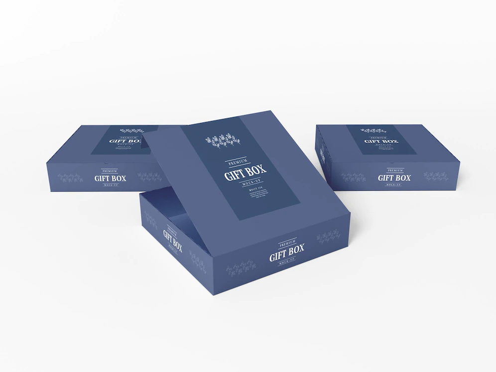
With hundreds of competitors and products on the market, appealing packaging design is your best and primary instrument to boost sales.
After all, you can’t stand beside your product on the store aisle to market your product in person, and it would be creepy if every brand owner did that!
But what drives the customers to choose specific packaging designs and not others? Psychology.
Visual cues elicit subconscious responses in people, and this is one of the cornerstones of marketing psychology. You will sell more products if you know how to make consumers like the packaging design.
When designing your packaging, keep in mind that the elements you incorporate into it will influence customers at a psychological level. In this post, we will guide you through strategies that will help you emotionally connect with your consumers.
Table of Contents
Texture
The feel of your goods may also attract customers. For instance, a product’s soft, fluffy texture will entice customers to hang on to it longer, increasing the probability that they will buy it.
Additionally, studies have shown that customers will perceive a beverage to be of more outstanding quality and, consequently, to have superior flavor if it is packaged in a robust, durable container.
Packaging shape
The shape of your packaging should distinguish you and elicit emotions. The Aunt Jemima syrup container is a prime illustration of this. The Aunt Jemima design, which is a parody of conventional syrup container shapes, gives the product a distinctive look while also evoking feelings of familiarity and home.
It’s also important to keep in mind that using curves in your product design will increase customer attractiveness. Straight, sharp angles are frequently interpreted as dangerous.
Typography
The typeface you pick for your design should give the buyers a peek into who you are. Whichever font type, style, and color you choose, your decisions will have an impact on how people view your product.
The typeface you choose should best represent your product. Decide what message you want to convey to your audience. If your product is playful and whimsical, decorative font is ideal for your design, while an ornate font will exude luxury.
Packaging color
Color has a great deal of power to draw our attention, and human attention has been demonstrated to be drawn to particular color wavelengths. Yellow, red, pink, and green are the four most attention-grabbing hues, according to research conducted in 2013.
Using these hues on your box will significantly enhance the chance that someone will pick it up and check inside. However, if all products had these three colors, what would keep them apart?
When selecting your packaging color, it is vital to make sure that it not only appeals to the buyer but communicates with them. For instance, red evokes passion, while blue is calming and comforting. Understand the message every color you pick sends to the audience to ensure that you remain within your brand’s context.
Conclusion
Being able to connect with your customers emotionally will do your company a lot of good. Your design is as important as the product itself (don’t leave anything to chance). If you are not a professional designer, we highly recommend that you work with one and connect with packaging professionals to correctly realize your creative vision.


