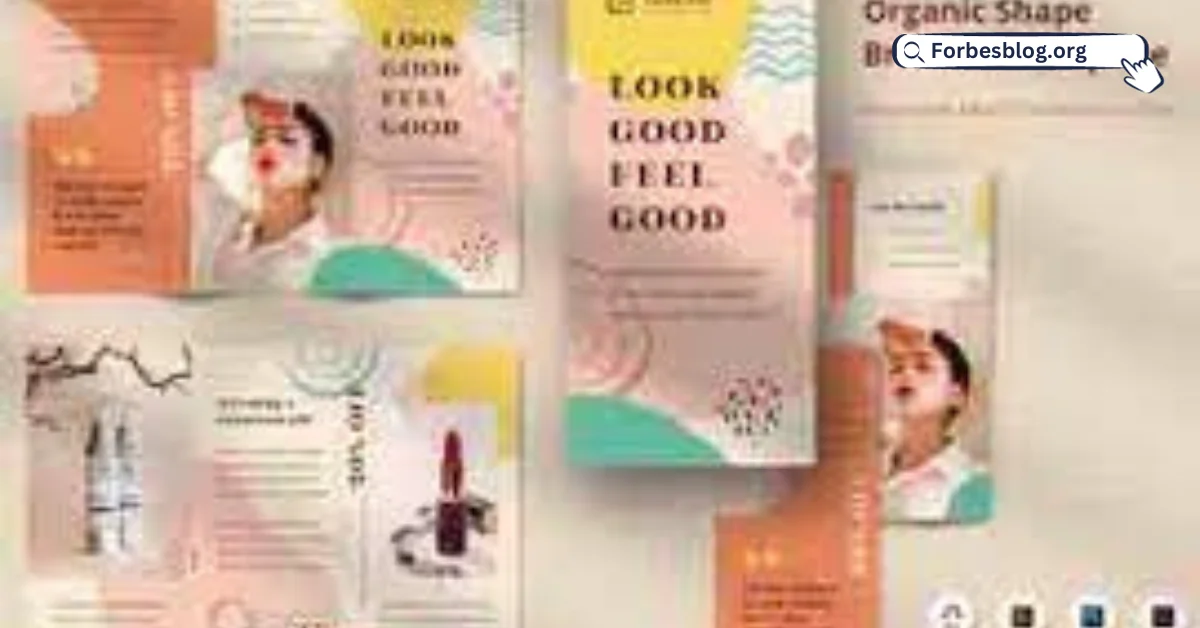
Promotional brochures can be an excellent way to promote your products or services or showcase upcoming events. However, there are certain things you need to do to make your brochures look the best they can. Here are some of the basics.
Table of Contents
Have pages in multiples of 8
Brochure printing, like the printing of books, usually works by printing several pages onto one big sheet—such as A1 size—and then folding it. The folded sheets are then stapled together on the spine, unless you are printing a particularly large brochure, in which case your printer will suggest other options such as perfect-bound—where the pages are glued to the cover in the way used for most mass market paperback books—or different types of sewn binding, such as Singer and section.
Because of this, your brochure will need to have pages in a multiple of 8. You can always add blank pages at the end, but that won’t look very professional or polished. Instead, keep this number in mind from the moment you start designing your brochure and move elements around until you achieve your desired number of pages. Remember that changing fonts or varying the font size can have a huge impact on the amount of space your text takes up!
Work in a CMYK color space
A color spaceis a set range of possible colors. Two of the main color spaces are RGB and CMYK. Designers work in RGB when they are producing materials that are designed to be viewed on a screen, as RGB—which stands forred, green, and blue—is the color display system used by digital monitors. By contrast,CMYK—which stands for cyan, magenta, yellow and black—is the method of mixing colors used by color printers, which means that to produce a brochure for printing, you need to work in CMYK. If you don’t, the way colors appear on your screen will be substantially different from the way they turn out in print. You can set the color space in all good design software, such as Affinity Designer, which is a much cheaper alternative to the mainstream Adobe Creative Suite.
Pay attention to finishes
In printing terms, a ‘finish’ is the type of coating that is put on the printed pages. The two most common types of finishes are gloss—a shiny coating that reflects the light, such as that found on most magazines—and matte—a duller coating common on paperback covers.Most brochures are printed on glossy paper because it makes colors ‘pop’. However, depending on your industry and the overall aesthetic of your brochure,you might be better off choosing matte paper, which can give your printed products a more refined and understated look.
Don’t forget the bleed
A ‘bleed’ is a small amount of space that is added to the edges of a design to ensure that all copies of the final product look the same, even if there are slight variations in the cropping. A 3mm bleed is standard, and you should make sure not to include any vital information too close to the bleed so it doesn’t get cut off.
Visit for more articles: forbesblog.org


